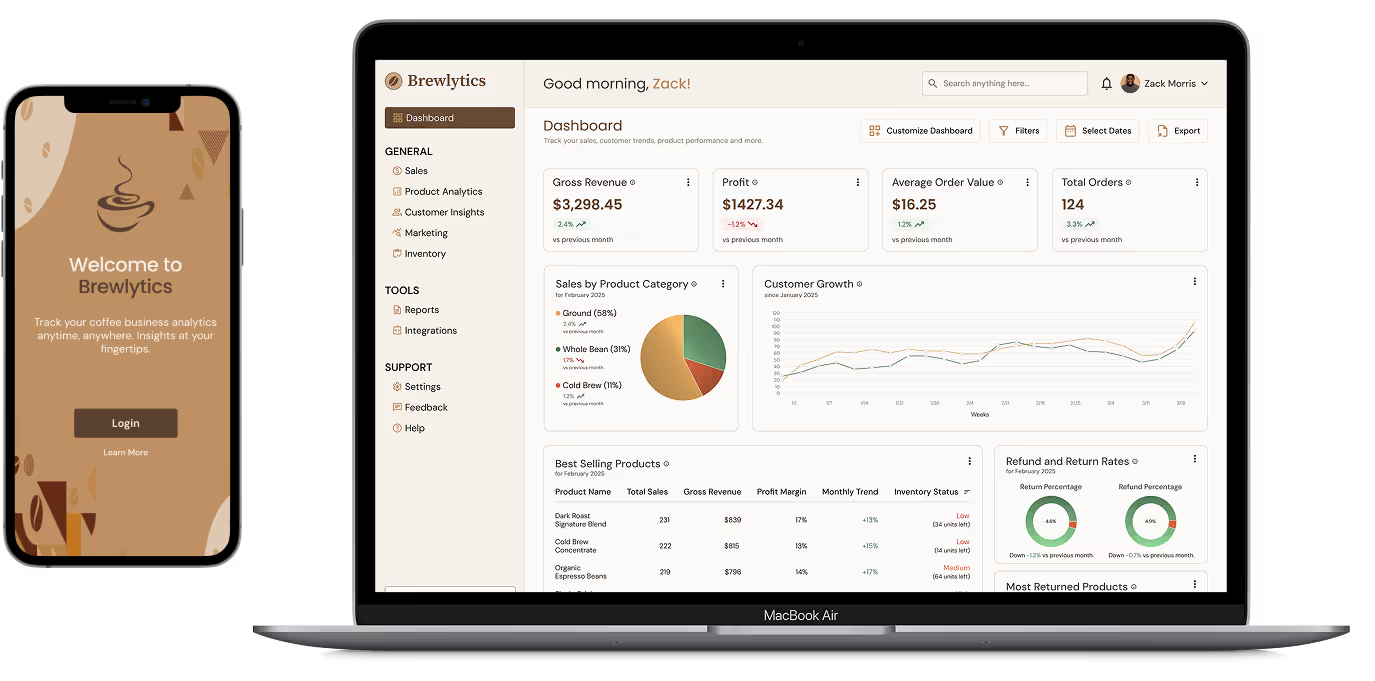
Brewlytics is a data-driven analytics dashboard designed specifically for coffee businesses, helping them track business necessities such as sales, customer insights, and product performance with ease. The goal was to create a visually intuitive and customizable experience that allows users to make informed business decisions without getting lost in complex data.
My Role:
UX/UI Designer, UX Researcher
Tools Used:
Figma, Webflow
Duration:
4 weeks
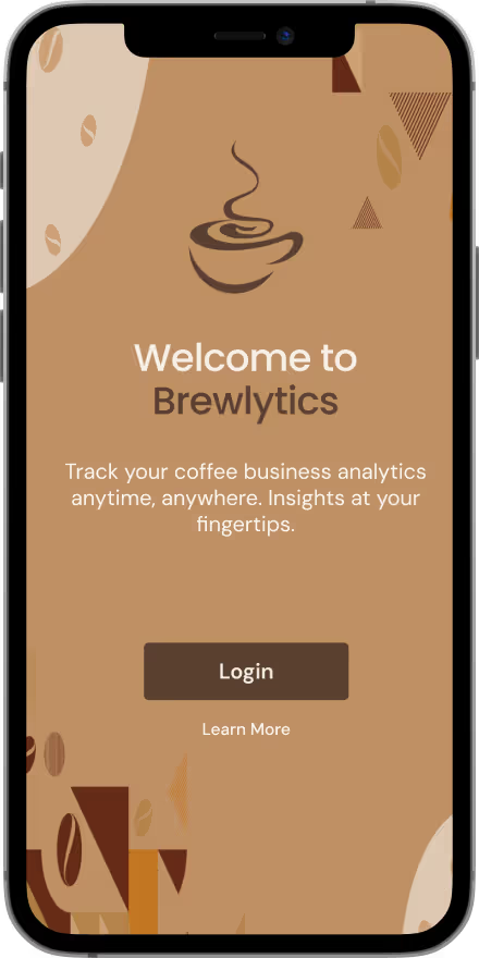
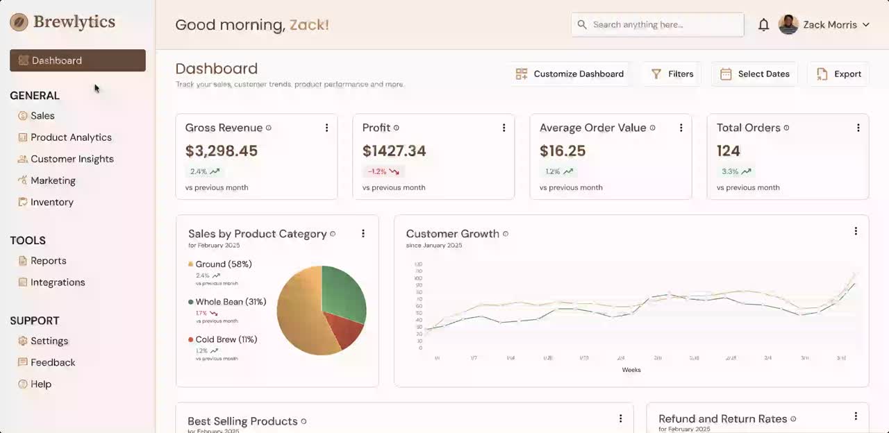
Test Prototype
Small to mid-sized businesses face challenges in tracking key metrics like online sales, customer behavior, and inventory trends. Existing analytics tools are often:
Without a clear, user-friendly solution, business owners may struggle to make informed decisions efficiently.
Brewlytics aims to empower business owners with a streamlined, intuitive analytics platform that transforms complex data into actionable insights. It would enable users to:
✅
Track real-time sales performance and identify top-selling and underperforming products.
✅
Monitor inventory levels to prevent shortages and overstocking.
✅
Understand customer behavior with insights into purchasing trends and preferences.
✅
Make data-driven decisions with clear, digestible visualizations designed for ease of use.
✅
Customize their dashboard to prioritize key metrics that matter most.

To ensure Brewlytics would meet the needs and expectations of its users, user interviews were conducted to understand their challenges.
Through the user interviews, I identified key insights and pain points that target users face in their daily life.

Complicated Dashboard
Users found existing analytics tools difficult to navigate, making it hard to extract meaningful insights.

Real-Time Tracking
Business owners need an intuitive way to monitor and track key business metrics such as stock levels to prevent shortages or overstocking.

Clear Data Visuals
Users prefer simplified, easy-to-read graphs over cluttered dashboards with excessive data.

Trend & Insight Identifier
Business owners expressed the desire to quickly spot trends or gain insights so they can adjust strategies proactively.
Using the defined goals and key insights gathered, a user persona was crafted to represent the target audience, ensuring design decisions align with their needs and challenges.

Zack Morris
Goals
Frustrations
To better understand the market landscape, a competitor analysis was conducted to identify strengths, weaknesses, and opportunities.
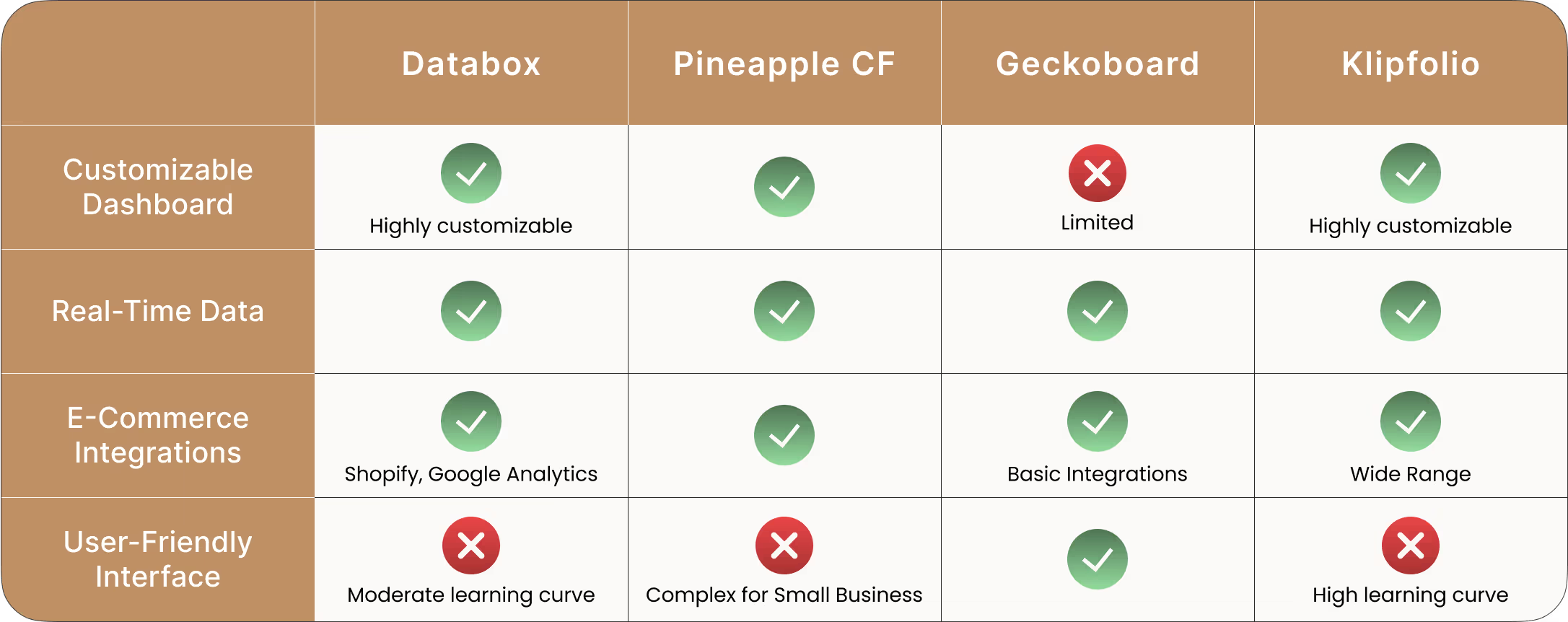
Key Takeaways for Brewlytics

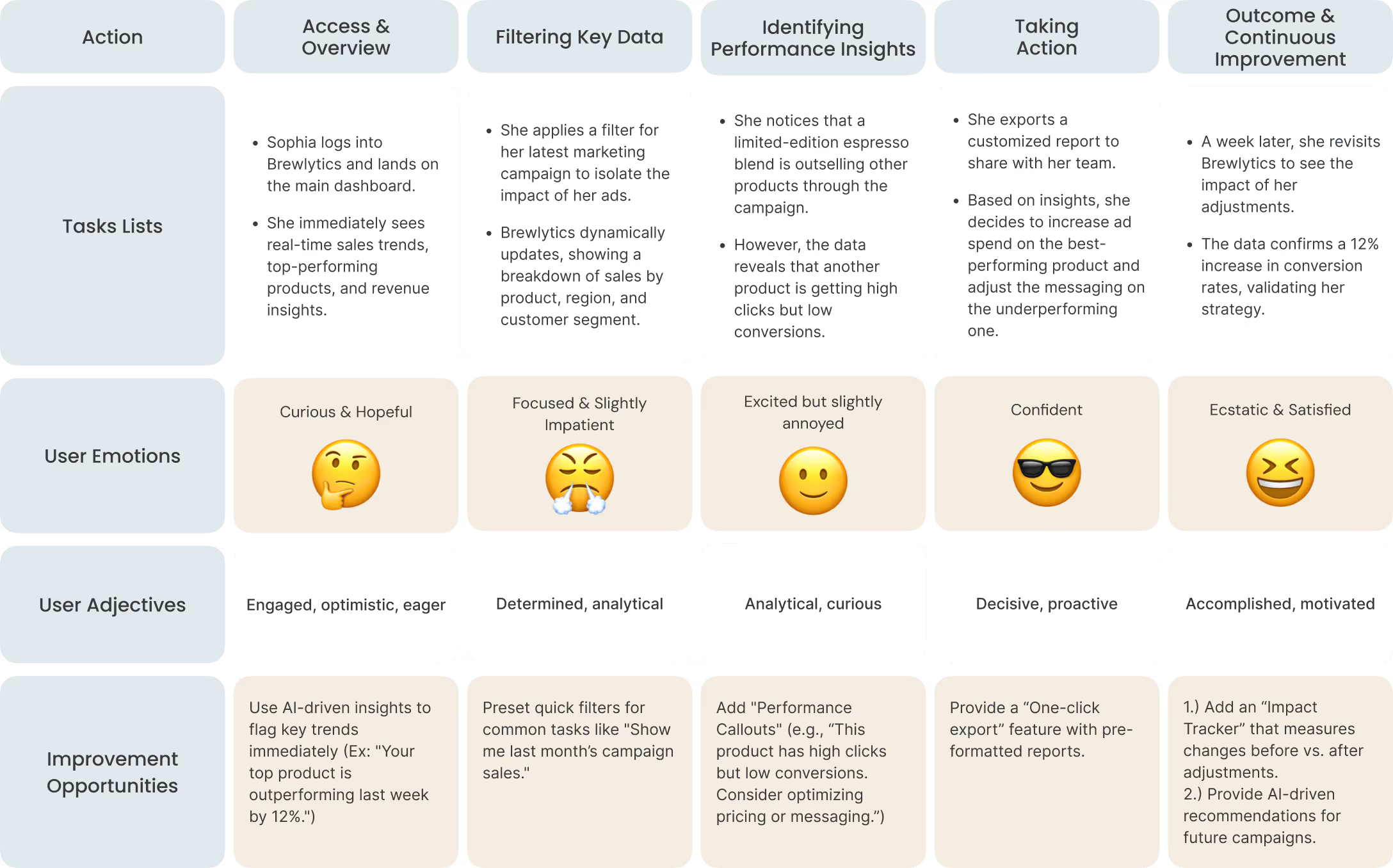
Scenario: Sophia is responsible for tracking marketing campaign performance for her online coffee business. She needs to quickly assess which products are driving the most revenue so she can adjust her ad strategy accordingly.
Goal: Analyze campaign-driven sales data to optimize marketing spend and boost ROI.
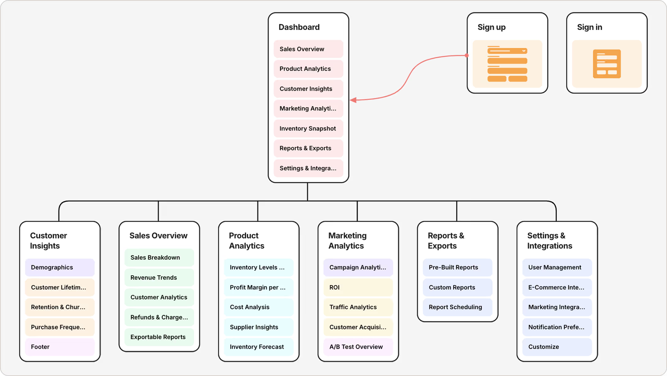
An information architecture was created to provide a blueprint for the overall design structure. By organizing content logically and prioritizing key insights, Brewlytics aims for users to navigate effortlessly and access the data they need with ease.
After reviewing the wireframes with target users, I gathered feedback to refine and improve the design even further.
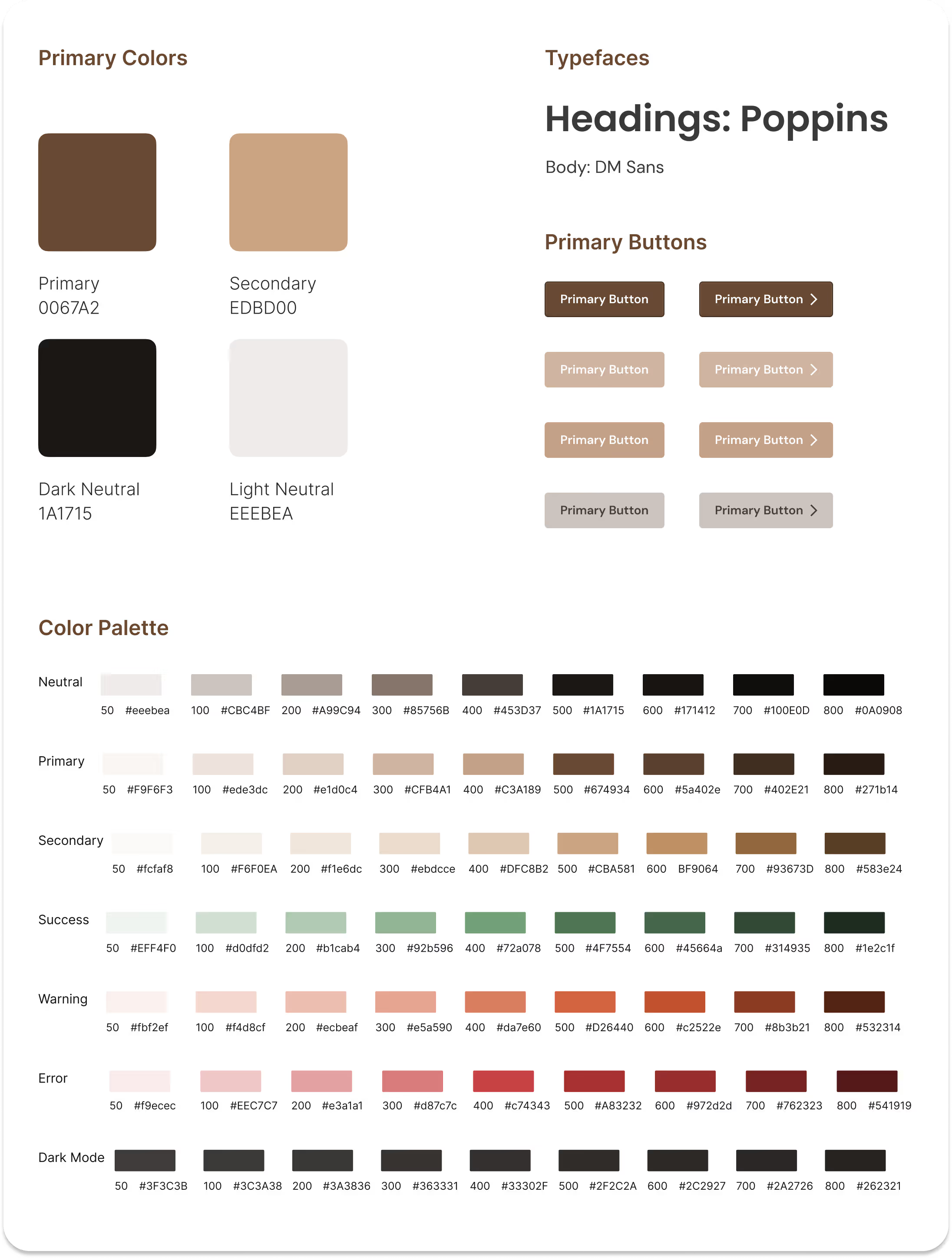
To ensure consistency and a cohesive visual identity, a style guide was created. This guide defined Brewlytics’ typography, colors, buttons, iconography, and spacing. This foundation streamlined the high-fidelity design process, maintaining usability and brand cohesion across the platform.
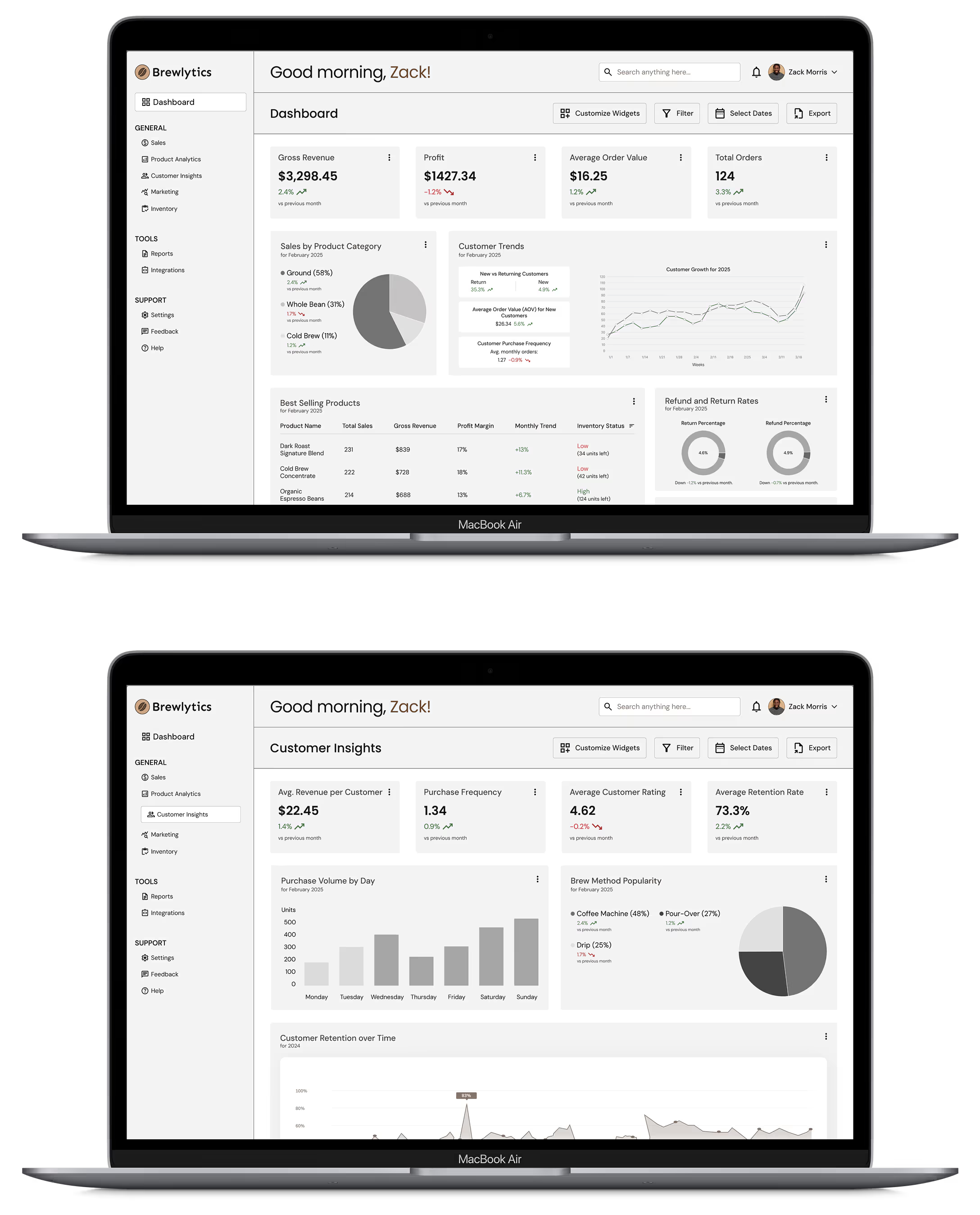
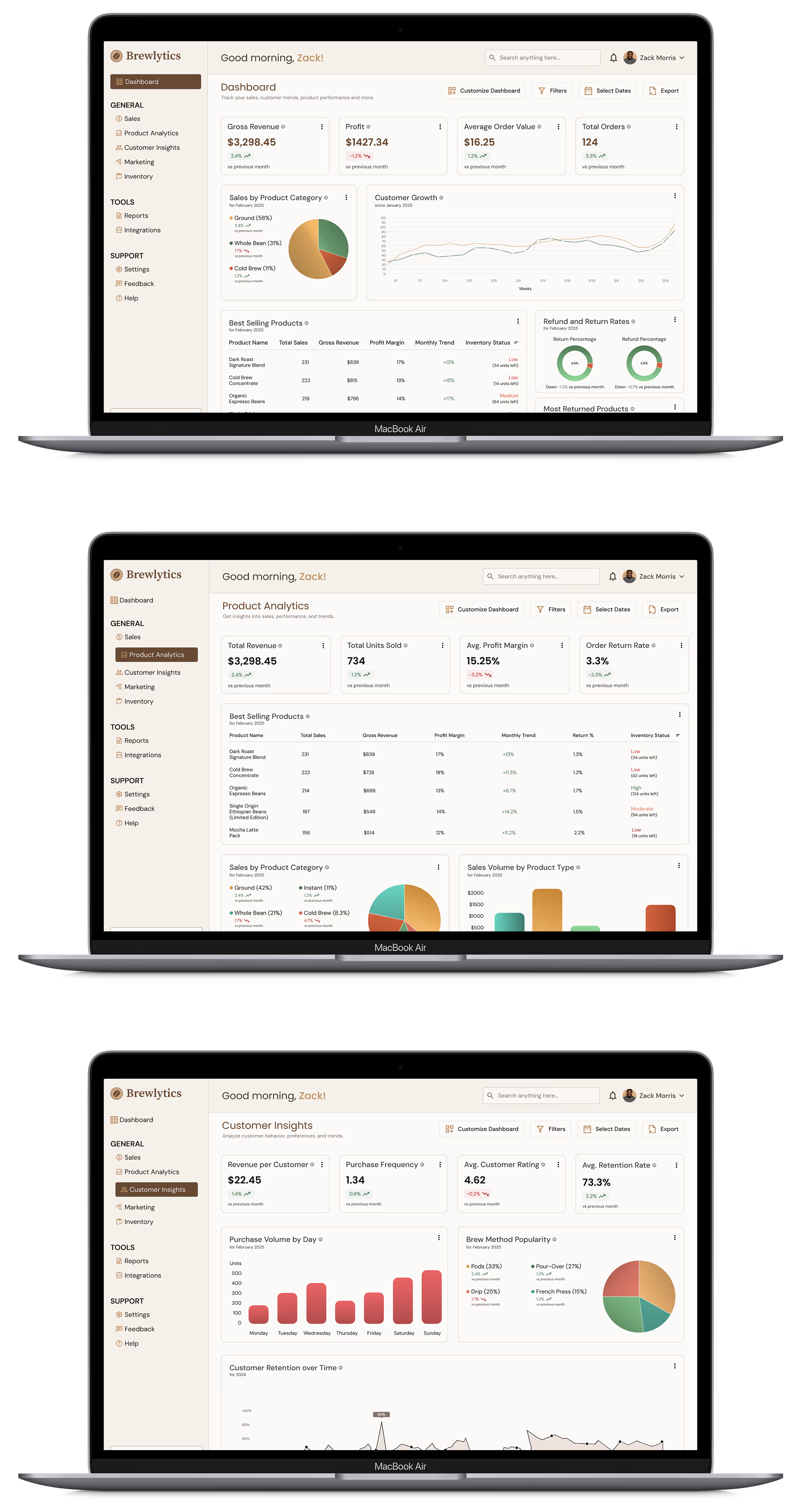
Incorporating the user feedback and the established style guide, the wireframes evolved into polished, user-friendly high-fidelity designs. This process involved:
With the high-fidelity designs finalized, the next step was to bring them to life by creating an interactive prototype. This allowed for realistic user interactions, enabling usability testing and refining the experience before development. This was achieved in Figma through:
View Prototype
Prototype Demo
After creating the high-fidelity prototype, I conducted
usability testing with five users to assess clarity, usability,
and visual appeal. Participants completed tasks and answered
open-ended questions, such as:
These tests uncovered valuable insights, leading to design
refinements that improved usability and user experience.

Enhanced Usability and Customization
Unlike standard analytics dashboards, Brewlytics is tailored specifically for e-commerce coffee businesses with industry-specific metrics an intuitive interface, and customizable dashboards, for a seamless user experience.

Improved Customer Retention
With customer insights metrics, businesses can track purchase patterns, loyalty trends, and engagement, enabling them to personalize promotions and enhance customer satisfaction.

Data-Driven Decision Making
Brewlytics empowers coffee business owners with real-time analytics, helping them make informed decisions on product sales, inventory, and customer trends without guesswork.

Increased Sales Through Insights
By identifying trends and insights, such as best-selling or under-performing products, businesses can adjust their offerings, optimize pricing, and improve marketing strategies to maximize revenue.
Creating and designing Brewlytics was a challenging but
immensely rewarding experience that helped me to both learn and
solidify key UX/UI principles. It taught me valuable lessons
about designing for data-heavy products while keeping the user
experience intuitive and engaging.
I truly appreciate your time and interest in my work and the
opportunity to share my design process, challenges, and learnings.
I hope this project gave you a more clear image of my approach to
UX/UI design, problem-solving, and user-centered thinking.
If
you have any questions at all or just want to chat, I’d love to
connect. 😃
Let’s Work Together


