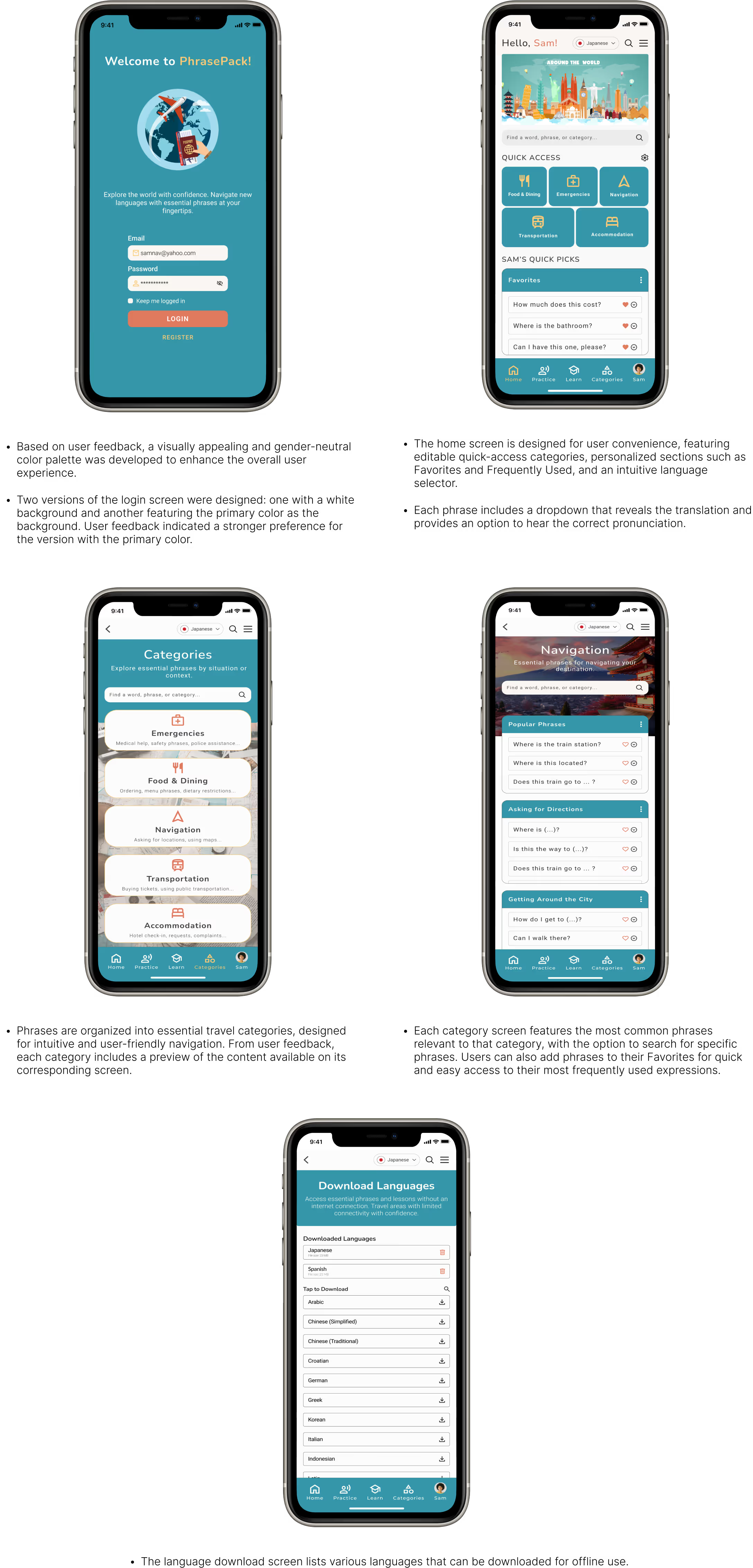
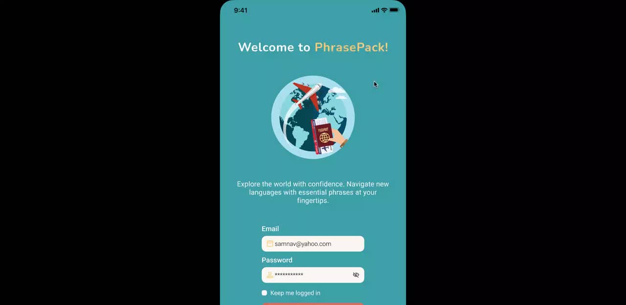
PhrasePack is designed to help travelers confidently navigate foreign countries with essential phrases, intuitive categories, and quick-access features—all tailored to real-life scenarios. Whether you’re asking for directions, ordering a meal, or checking into a hotel, PhrasePack is your pocket-sized travel assistant, ensuring that language is never a barrier to adventure.
My Role:
UX/UI Designer, UX Researcher
Tools Used:
Figma, Webflow
Duration:
4 weeks
Test Prototype
Traveling to a foreign country can come with the challenge of
overcoming language barriers, making essential interactions
difficult. Many existing translation tools fall short in key
areas, leaving travelers without a reliable solution when they
need it most. Key challenges include:
The goal of this project is to design an intuitive and user-friendly mobile interface that equips travelers with the essential language tools needed to navigate foreign countries confidently in any situation.

Three user interviews with target users were conducted to explore their experiences and challenges. Interviewees included: a solo traveler, a business traveler, and a first-time traveler.
Through the user interviews, I identified key insights and pain points that target users face while traveling.

Convenience
“I really don’t need to learn an entire language. I just need to know how to order food or ask for things.”

Pronunciation Assistance
“Even when I know the words, I’m not sure if I’m saying them correctly.”

Emergencies
“If I’m in trouble, I won’t have time to search for what I need. I want it to be right there.”

Offline Mode
“There’s situations where I can’t rely on Wi-Fi like when I’m on an overnight bus and translation apps are useless without it.”
Using the defined goals and key insights gathered, a user persona was crafted to represent the target audience, ensuring design decisions align with their needs and challenges.
Sam Nevara

Goals
Frustrations
To better understand what language and travel apps are available, a competitor analysis was conducted to identify strengths, weaknesses, and opportunities.
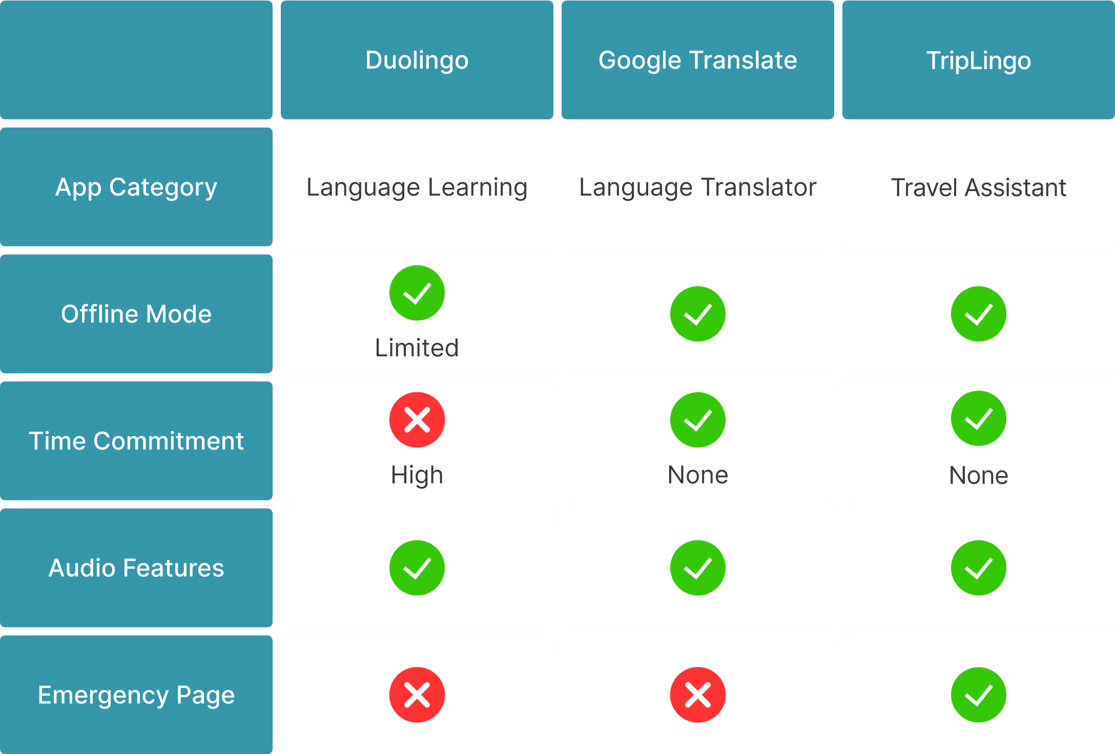
Key Takeaways for PhrasePack
These insights along with previous user research helped define the essential features that would make PhrasePack more effective and user-friendly.

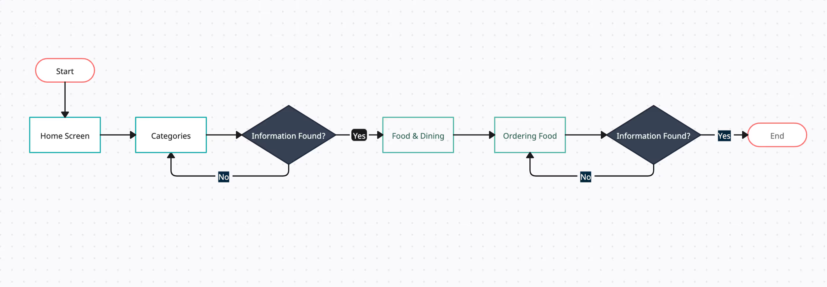
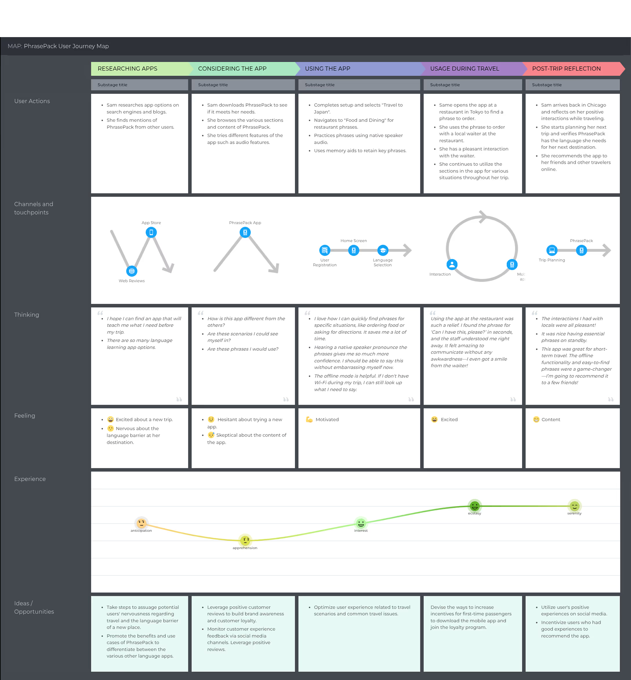
Scenario: Sam, a solo traveler traveling in Tokyo, wants to learn the phrase to order food at a local restaurant.
Scenario: A freelance photographer preparing for a trip to Japan, aiming to use and learn essential travel phrases and navigate confidently in a foreign country.
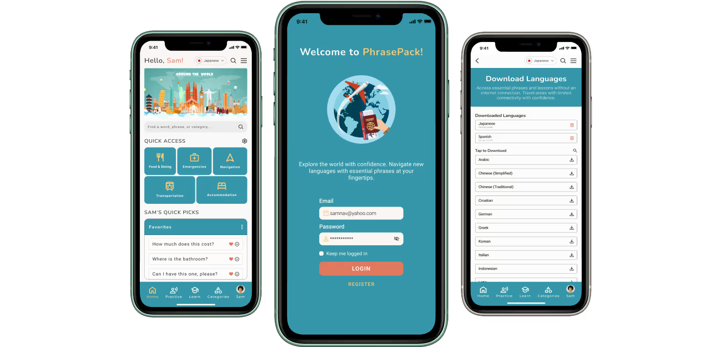
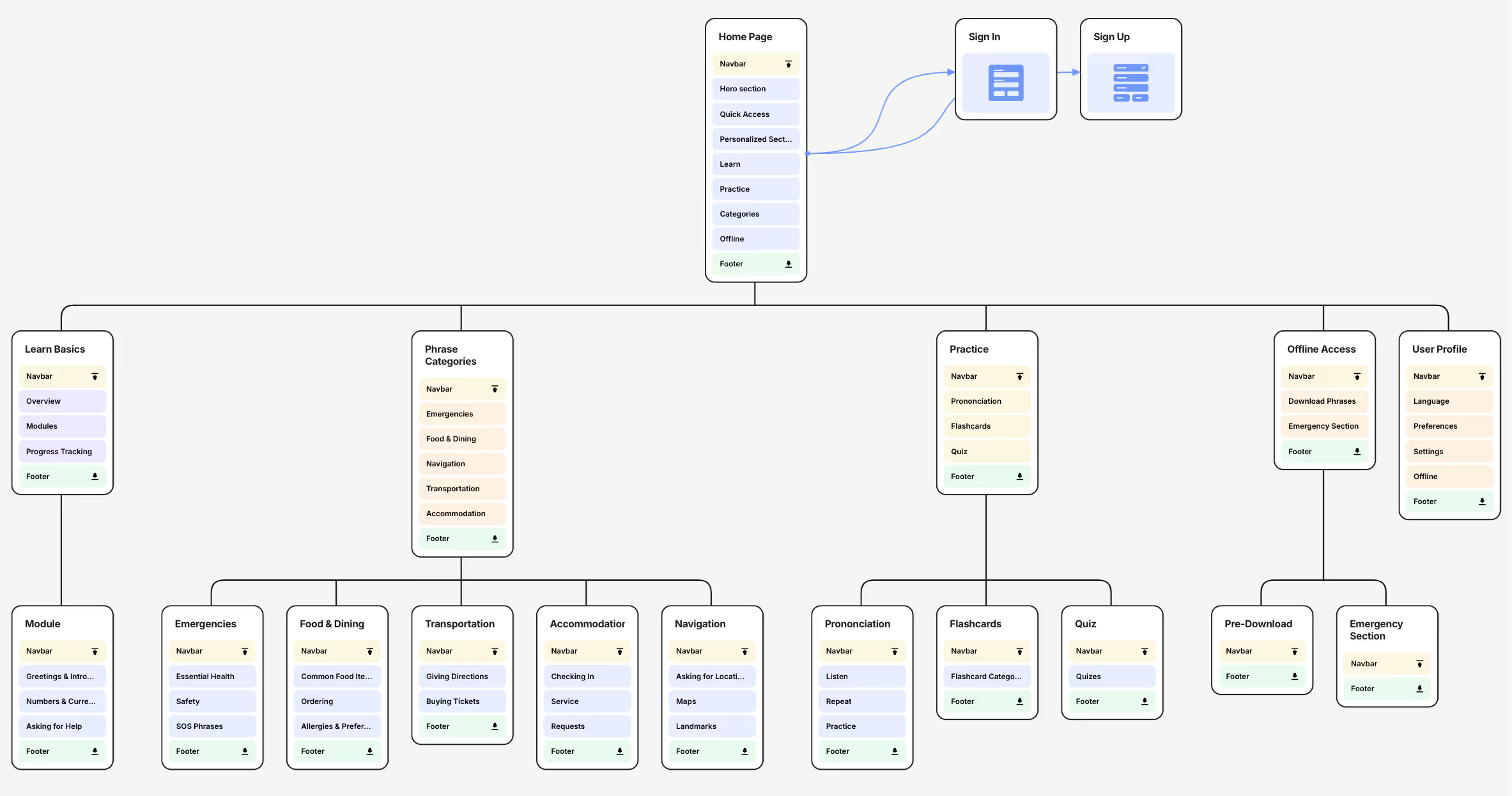
An information architecture was created to provide a blueprint for the overall design structure. By organizing content logically and prioritizing key insights, PhrasePack aims for users to navigate effortlessly and find the information they need with ease.
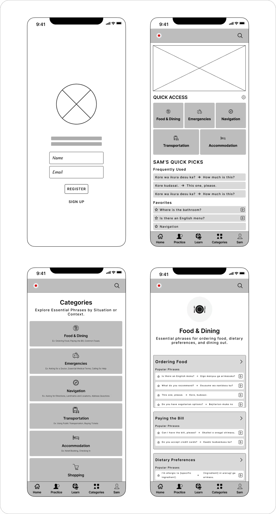
After reviewing the wireframes with target users, I gathered feedback to refine and improve the design even further.
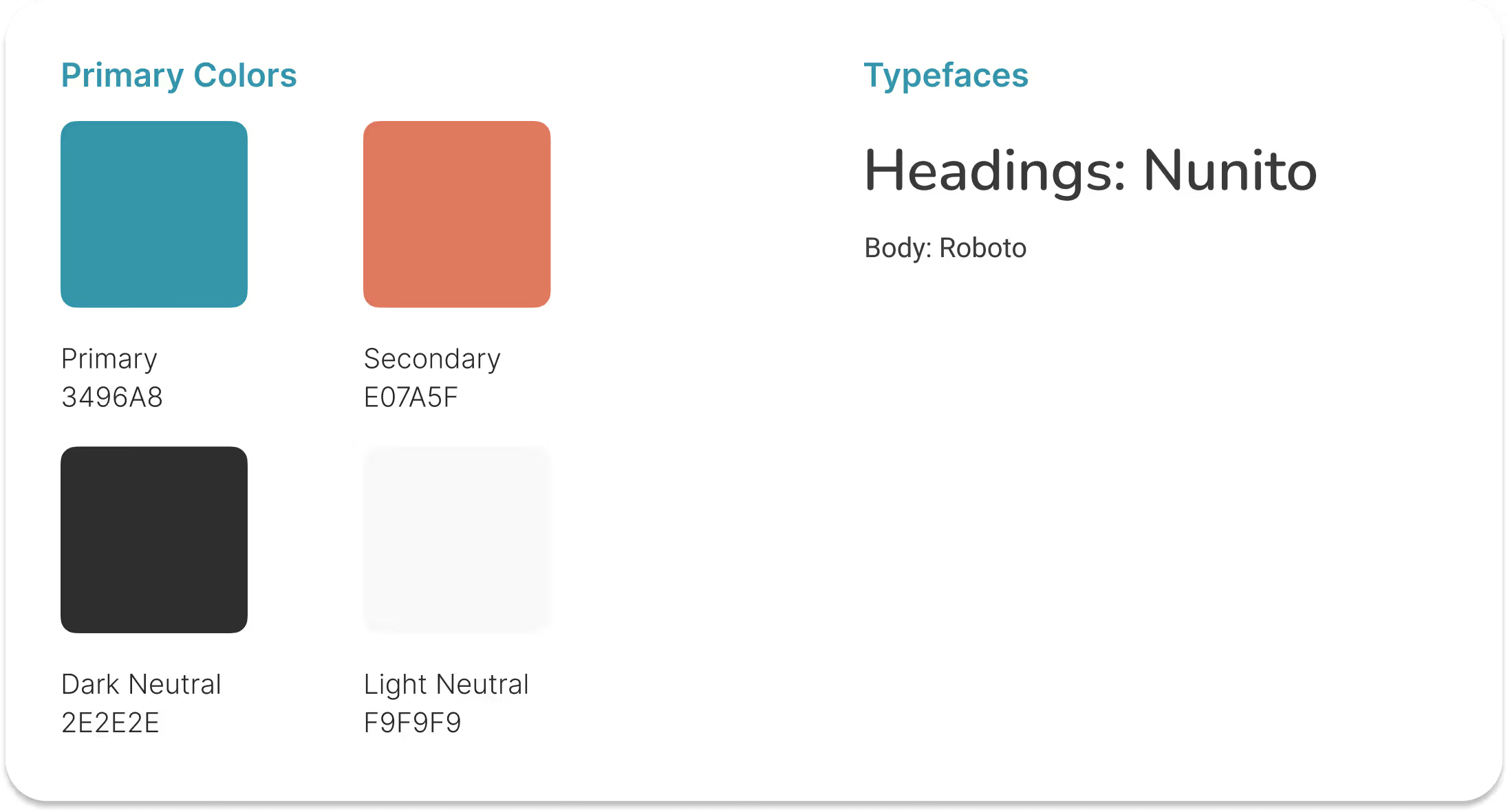
A style guide was created to ensure consistency and a cohesive visual identity. This guide defined PhrasePack’s typography, colors, buttons, iconography, and spacing. This foundation streamlined the high-fidelity design process, maintaining usability and brand cohesion across the platform.
Based on feedback from previously interviewed users, I began designing the first iteration of the high-fidelity prototype. Throughout this process, I created a mood board by drawing inspiration from various design platforms, including Dribbble and Behance, to refine the visual and functional aspects of the app.
After completing the initial draft of the high-fidelity design, I conducted another round of user feedback sessions. Some questions included:
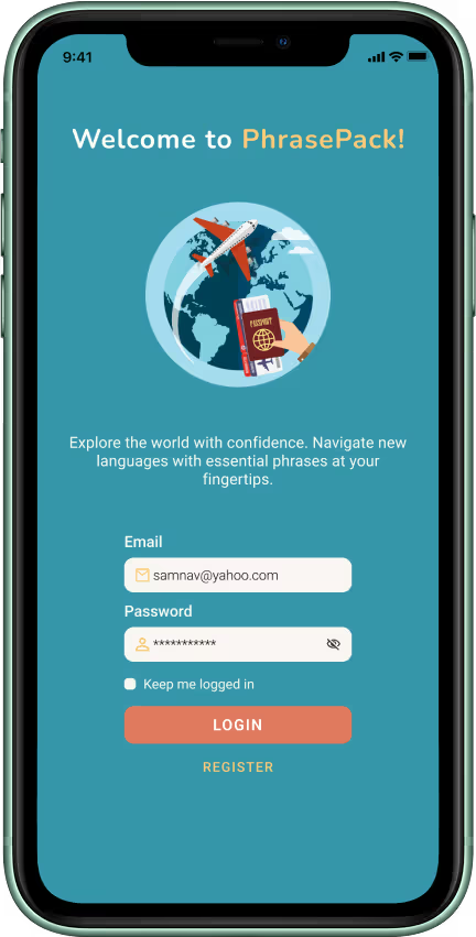
Using this feedback, I implemented several design improvements to enhance usability, readability, and visual appeal. Below is the final result, reflecting these iterations.
With the high-fidelity designs finalized, the next step was to bring them to life by creating an interactive prototype. This allowed for realistic user interactions, enabling usability testing and refining the experience before development. This was achieved in Figma through:
View Prototype
Prototype Demo
After finishing the prototype, a round of usability testing was
conducted to validate improvements and identify any remaining
pain points. Users were asked to navigate the app, complete key
tasks, and provide feedback on clarity, accessibility, and
overall usability. This round focused on testing the
effectiveness of the refined color palette, improved
readability, and enhanced category organization.

Empower Travelers with Confidence
Users will be able to communicate essential phrases effortlessly, reducing anxiety and enhancing their overall travel experience.

Break Down Language Barriers
Users can have smoother interactions with locals, fostering better connections and cultural appreciation.

Improved Access to Vital Knowledge
Provides a streamlined, user-friendly way to access vital travel phrases in seconds, especially in time-sensitive situations.

Increase Convenience for Offline Use
Reduces reliance on Wi-Fi or mobile data by offering an offline mode, ensuring accessibility in remote or low-connectivity areas.
Creating PhrasePack was both a challenging and rewarding
experience that reinforced key UX principles and deepened my
understanding of user-centered design. Through multiple
iterations—driven by research, feedback, and usability
testing—the app evolved into a streamlined solution that helps
travelers communicate effortlessly in foreign environments. My
biggest insights from the process:
I truly appreciate your time and interest in my work and the
opportunity to share my design process, challenges, and learnings.
I hope this project gave you a more clear image of my approach to
UX/UI design, problem-solving, and user-centered thinking.
If
you have any questions at all or just want to chat, I’d love to
connect. 😃
Let’s Work Together


